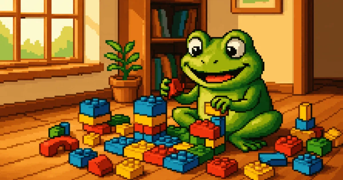
I’m building the SaaS dashboard for Malla right now, this week, as I write this, which is part of why I wanted to write about it while it’s still live instead of waiting for it to be finished and tidy. The pitch for the thing, internally, is simple: every card on the dashboard is a lego brick. You can drag it, resize it, and swap it for a different card entirely, and the grid underneath doesn’t care which one you put where.
It didn’t start as an engineering decision. It started as an HTML mockup I built for Bryan back in July, a single static file with a fake dashboard in it, no framework, no real data, just enough of the idea rendered in a browser that he could look at it and say yes or no before anyone wrote a line of production code. A second version followed, the same layout in a light neumorphic skin. Those two files did their job. By mid-August the idea had earned enough conviction to become the real thing: mallasaas, a proper modular dashboard ported faithfully off that original mockup, built on react-grid-layout, a twelve-column grid where every card is a first-class, independently draggable, resizable, swappable unit.
The reason that matters more than it sounds like it should: Malla isn’t one business. It’s a POS and SaaS platform meant to serve restaurants, fine dining, retail, bodegones, pharmacies, bakeries, a dozen different sector shapes, each with a genuinely different idea of what their home dashboard should show first. Building a bespoke dashboard per sector doesn’t scale, not in engineering time and not in design coherence. The lego approach is the answer to that specific problem: build the bricks once, theme-aware and sector-agnostic, and let each business’s dashboard be a different arrangement of the same real components instead of a different codebase.
I believe in this thing. Malla exists because small businesses across Venezuela have been sold POS systems built for someone else’s country, someone else’s currency, someone else’s assumptions about what a bodegón or a licorería needs to see first thing on a Tuesday morning. Getting the dashboard right, patient enough to build the grid correctly instead of shipping something that merely looks finished, is my way of taking that seriously instead of just saying I do. That’s why I’m still at this screen some nights instead of calling it good enough and moving on to the next one.
We’ve built five of those shared cards so far, sourced from real Dribbble references and then generalized: a hatched-bar report chart, order-status blocks, a honeycomb customer visualization, occupancy bars, a weekly summary card. None of them are hardcoded to look like anything in particular. They inherit color and shape from whatever theme the tenant has active, which brings me to the second system underneath all of this, one we ended up calling the three mothers: glass, neumorphic, and flat, three complete visual languages living behind a single data-style attribute, switchable live, no rebuild required.
Getting the three mothers to coexist honestly was harder than naming them. Neumorphism specifically fought us. The first fix for a shadow-clipping bug broke a table that depended on the exact overflow behavior we’d just removed. The second fix undershot the real shadow reach, caught only because I was watching it live and said something was still wrong. The third fix shrank the cards enough to hide the problem instead of solving it, which I also caught live, because they’d gone from wrong to just small and awkward instead of right. The actual fix, the one that stuck, was giving the affected panels their own internal scroll containment so nothing downstream had to depend on a shared overflow rule at all. Three wrong turns, in front of the person who has to live with the result, before the real one. That’s most of what building a design system that has to survive contact with real screens feels like.
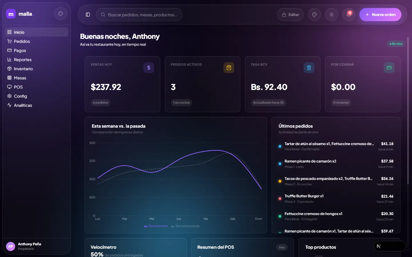
The Restaurantes Inicio dashboard, desktop, live. Every card in this screenshot is one of the swappable bricks described above.
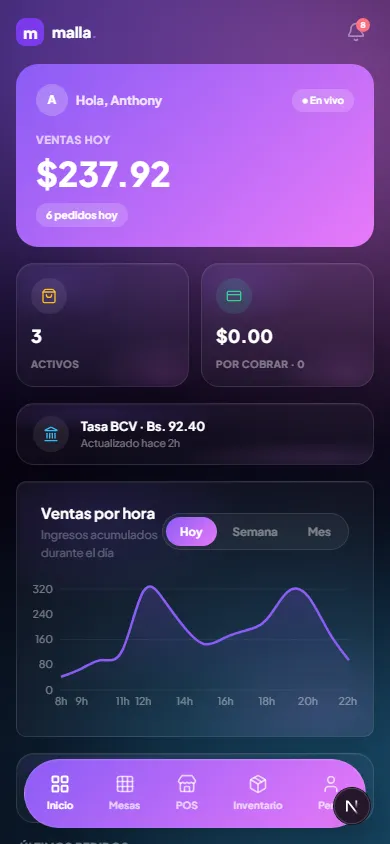
The same dashboard on mobile. Same bricks, same grid logic, restacked.
None of that is what I want to walk through, though. What I want to walk through is the POS module, and the moment I stopped trusting my own pattern.
The POS screen is where a cashier rings up an order: pick a category, pick items off a catalog, watch a cart build up, take payment. We’d already built four other screens, Inicio, Mesas, Inventario, Config, all on the same lego grid, all draggable and swappable, and the instinct going into POS was to keep doing the thing that had worked four times in a row. Halfway into a redesign pass, I stopped and asked directly: is this a bad decision for POS?
It was. Categorías, Catálogo, and Carrito aren’t three independent views a business owner might want to rearrange or replace. They’re three faces of exactly one transaction, happening in exactly one order, every single time. Letting someone drag the cart panel somewhere else or swap the catalog for a different card type doesn’t add flexibility, it adds a way to break the one flow that has to work every time without fail. So Vender, the selling screen, got a fixed, bespoke layout instead, the same category of decision as Mesas and Inventario, which are similarly one coherent thing rather than a collection of swappable parts. Pedidos, the order-tracking kanban sitting right next to it, kept the real draggable grid, because its columns genuinely are independent views of independent state, and treating them as swappable lego actually reflects what they are.
That’s what’s worth sitting with, more than the grid system itself. A modular system is a real accomplishment when you build it, and it is tempting to keep applying it everywhere just because it’s already built and it already works. The discipline isn’t building the pattern. It’s noticing, in the middle of using it successfully, the one place where using it again would be lazy instead of correct, and having the judgment to build something fixed and boring right next to something flexible and clever, on purpose, because the thing being built actually called for it.
I like this kind of work in a way I don’t think I fully admit often enough on this blog. There’s a specific pleasure in a card that snaps cleanly into a grid slot, in a theme switch that doesn’t flicker, in a shadow that finally sits where it’s supposed to after the third attempt. It’s close to the pleasure of an actual lego set, which is probably why the name stuck the way it did. But the real craft isn’t in how satisfying the bricks are to snap together. It’s in knowing, screen by screen, whether you’re looking at something that wants to be built from bricks, or something that just needs to be built, once, correctly, and left alone.
If you’re building anything right now with reusable pieces, a component library, a template system, a framework of your own, ask yourself the same question I had to ask myself, and ask it honestly instead of on autopilot. Don’t ask whether the pattern works. You already know it works, that’s exactly why it’s tempting to reach for it again without thinking. Ask whether the thing sitting in front of you is actually made of independent pieces, or whether you’re the one forcing independence onto something that only ever wanted to be one whole thing. The system in front of you will never tell you the difference on its own. You have to actually stop and look.
Malla’s dashboard isn’t finished. Retail, Bodegón, Farmacia, and the rest of the sectors still need their own dashboards built on top of this same system, and that’s next. But the system itself, the grid, the shared cards, the three mothers, and now the honest exception carved out for POS, is real, live, and something I’m proud of in the specific way you’re proud of a decision you almost got wrong and caught in time.