What started as a rebuild became a building.
The original brief was to redo an existing agency site. What came out the other side was something different: Klayen, a software engineering agency built from scratch around the question of what a premium technical partner should feel like in the browser. New identity, new system, new name.
The answer we landed on was neumorphism. And neumorphism turned out to be harder than it looks.
Neumorphism is the design language that asks surfaces to have weight. Not elements floating above a page but elements emerging from it. The argument is simple: what if an interface felt like it was shaped rather than assembled? For a software agency positioning itself as an engineering partner for complex systems, that argument was the right one. The site had to feel like the work it represents. Precise. Considered. Built by someone who cared about the material.
What neumorphism actually is
The word sounds more exotic than the technique. Neumorphism is box-shadow.
That’s not a dismissal. It’s the thing you have to understand precisely before you can do it correctly. The classic approach uses two shadows on every raised element: a lighter one in the top-left direction and a darker one in the bottom-right. Together they create the illusion that the element is extruded from the surface rather than floating above it.
box-shadow:
  -6px -6px 12px var(--shadow-light),
   6px  6px 12px var(--shadow-dark);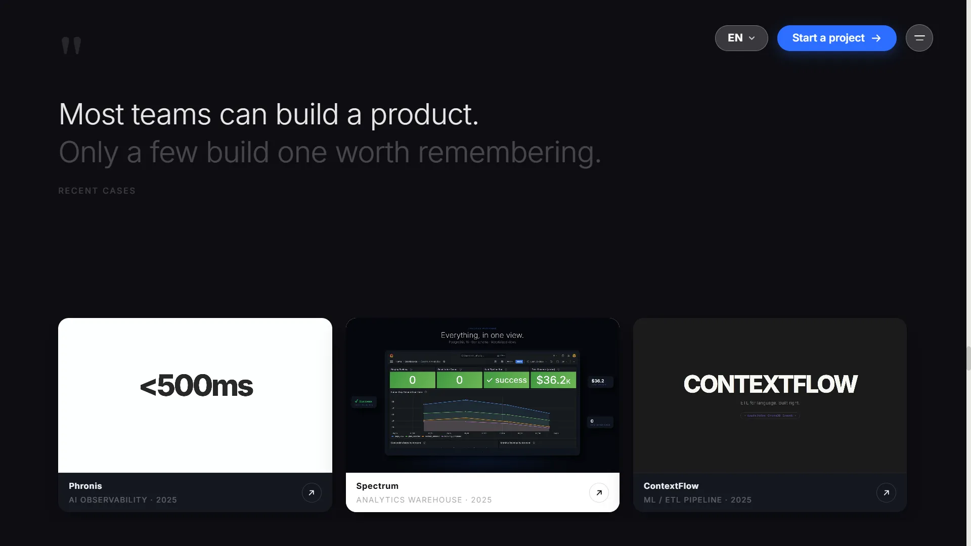
The constraint that makes it work or breaks it: the element’s background color must match the canvas exactly. Not approximately. Exactly. If a card has background #f5f4f0 and the canvas behind it is #f4f3ef, the extrusion illusion collapses. You see a card with blurry edges. You don’t see something emerging from the surface.
This isn’t a stylistic choice. It’s a physics constraint baked into the technique. The shadow reads as depth only because the eye is tricked into believing the surface continues under the element. Break the background match and you break the premise.
The design system we built for this project, called Kleyo internally, treats this as a first-class rule. Every token flows from a single canvas value.
The Kleyo system
Kleyo started as a name for the clay concept: UI elements that feel physical, moldable, tactile. The design references were qclay.design for the scroll-driven drama and awsmd.com for the editorial layout scale.
The palette decision that changed everything was rejecting the dark build.
The first version was dark: canvas #0d0d12, a near-black with a slight blue hue (pure black breaks neumorphism for the same reason as mismatched backgrounds). It passed a clean build. It looked correct on screen.
It looked small and generic.
Dark communicates seriousness but not surprise. Every agency that wants to look premium picks dark. The evidence is the problem: when everyone uses the same signal, the signal stops meaning anything.
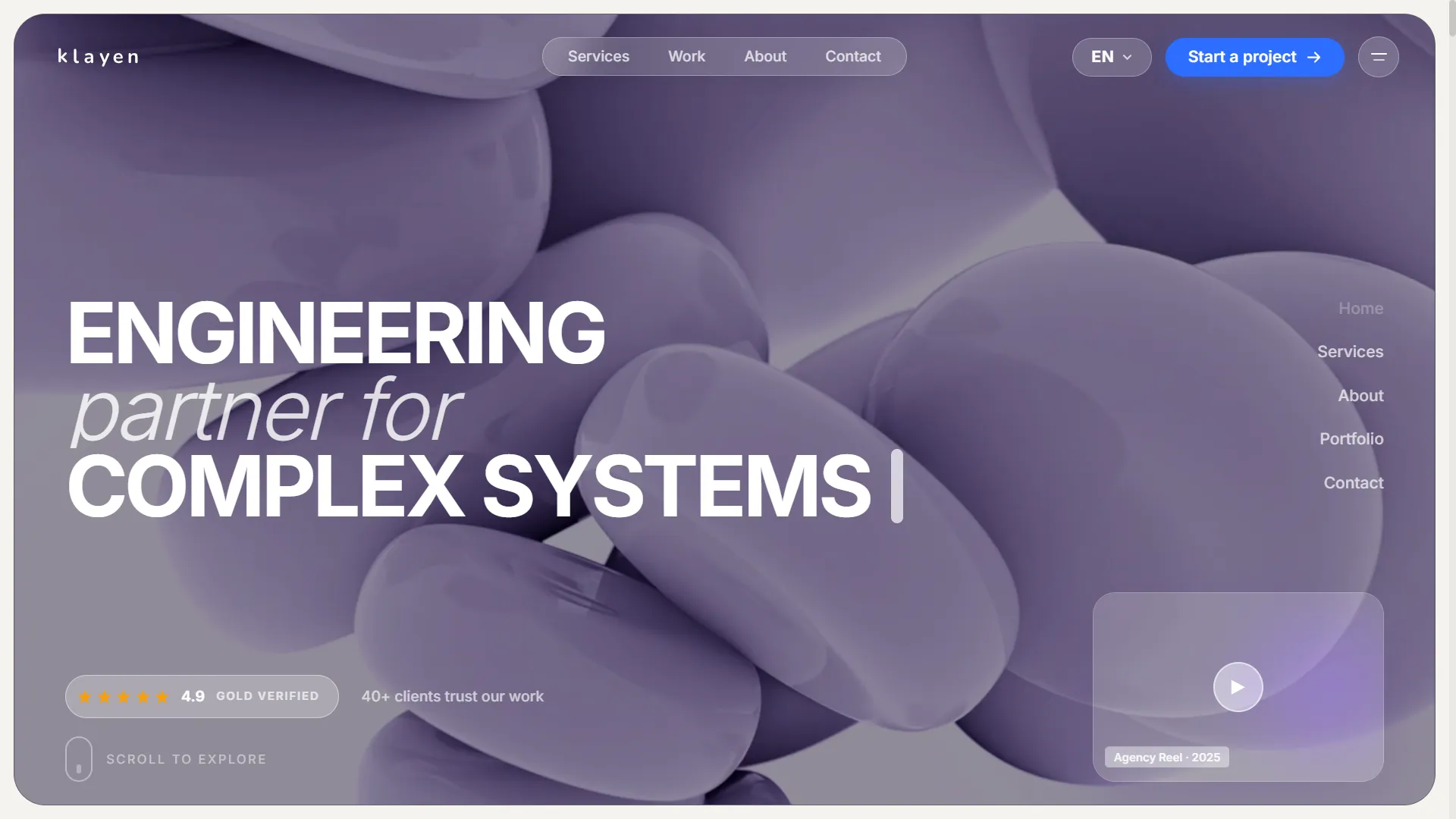
The pivot was to warm off-white: canvas #f4f3ef. And then something that wasn’t in the original reference: a lavender-to-purple gradient hero (#dcd5f2 to #b8aee5), inspired by awsmd’s hero palette, instead of extending the off-white or going dark. White text on a colored hero, dark footer as a contrast bookend. The warm surface in between.
The full token set:
| Token | Value | Role |
|---|---|---|
--canvas | #f4f3ef | The base. Everything neumorphic must match this |
--canvas-raised | #ffffff | Card surfaces that float above the base |
--canvas-sunken | #ebe9e4 | Alternate section backgrounds |
--accent-primary | #2c6eff | Electric blue. CTAs, links, active states |
--accent-secondary | #7c3aed | Violet. Secondary accents |
Typography: Bebas Neue for all display headings (all-caps condensed, the thing that makes section headers feel like editorial), Inter for body, Geist Mono for data labels. Hero text at clamp(96px, 13.5vw, 220px). The sizing rule: it must fill about 70% of the viewport at all sizes. If it doesn’t, it’s decorative. It should feel structural.
Stack decisions
The framework is Next.js with App Router. Not Astro, which is where frogwebp.com lives. The reasoning from the team: an agency site needs SEO but also needs to grow into backend integrations in the same monorepo. A contact form API route, a chatbot, a booking flow. Astro can do that, but Next.js does it with less friction. You don’t want to have the architecture conversation twice.
Styling is Tailwind v4. The meaningful change from v3 is the @theme directive: instead of extending a tailwind.config.js, you define tokens inline in CSS.
@theme {
  --color-canvas: #f4f3ef;
  --color-accent-primary: #2c6eff;
  --font-display: "Bebas Neue", sans-serif;
}
These become both CSS variables and Tailwind utility classes. bg-canvas, text-accent-primary, font-display. The design system lives in one file. The honest note: we violated this for most of the build.
The scroll-driven animations and why I used inline styles
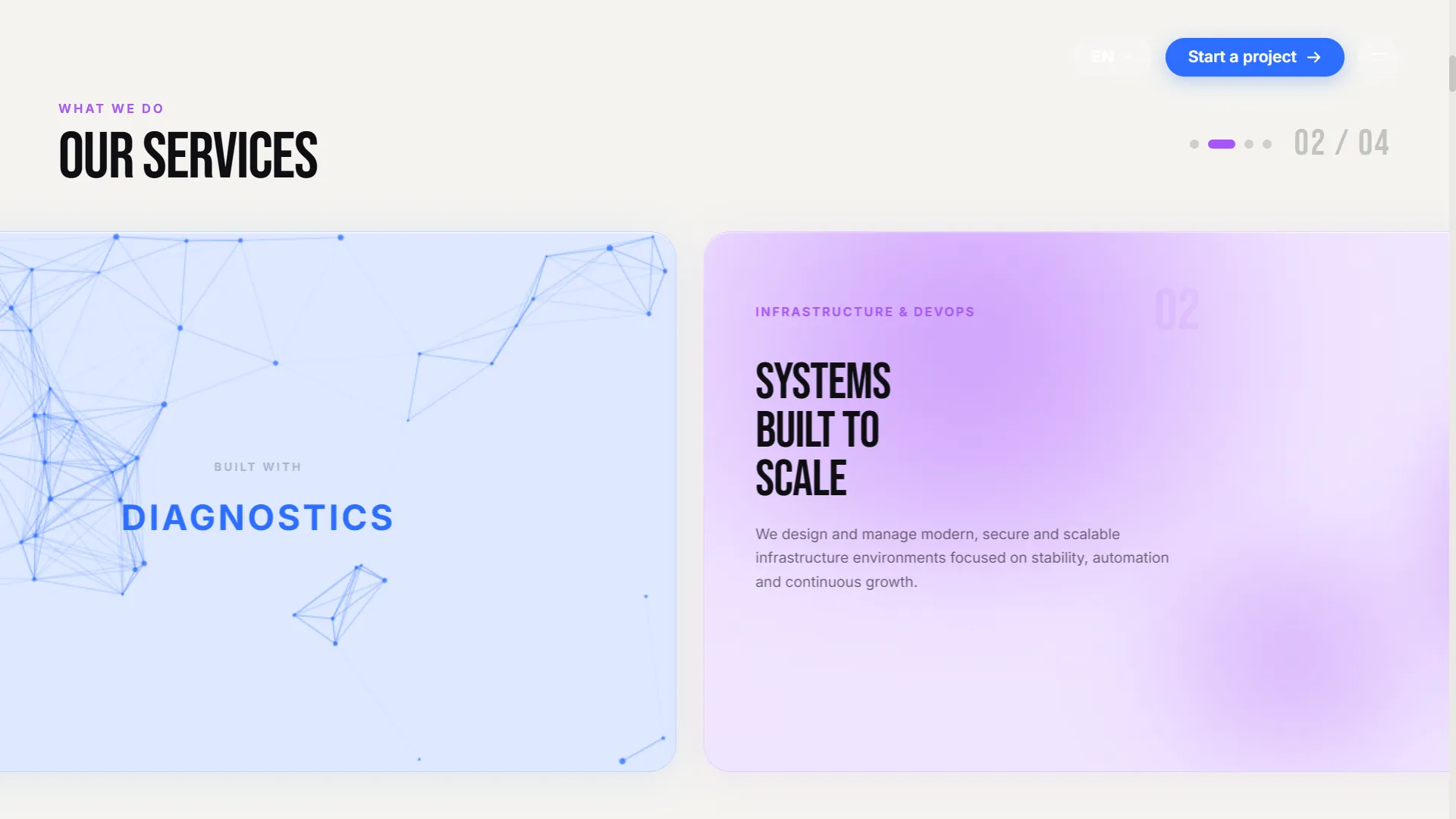
ServicesSlider and Cinematic, the two most complex sections, use a manual scroll-progress pattern.
// Outer: tall enough to create scroll room
// Inner: sticky so it stays in view
<div style={{ height: '500vh' }}>
  <div style={{ position: 'sticky', top: 0, height: '100vh' }}>
    {/* progress 0→1 drives everything */}
  </div>
</div>
A useEffect listens to scroll and computes progress from getBoundingClientRect:
const progress = Math.max(0, Math.min(1,
  -el.getBoundingClientRect().top / (el.offsetHeight - window.innerHeight)
));
That single value, 0 to 1 as the user scrolls through the section, drives every transform and opacity update via React state. No animation library. The stack includes anime.js (installed, not yet wired), but the manual pattern was faster to build correctly and easier to debug when something looked wrong.
Everything in these sections uses inline style={{}} props. This is flagged in the project’s decisions log as intentional debt. During visual iteration, computing animation positions, gradient stops, and transform values from scroll progress is easier in code than in Tailwind classes. The design was being discovered as we built, not implemented from a finished spec. Inline styles let you change a number and immediately see the result without naming a utility or figuring out where the class belongs.
The plan is a refactor pass once all sections are visually finalized: replace inline styles with @theme tokens and Tailwind utilities. That refactor will probably be straightforward because the design is already well-tokenized. But doing it during the visual pass would have added friction to a phase that required speed.
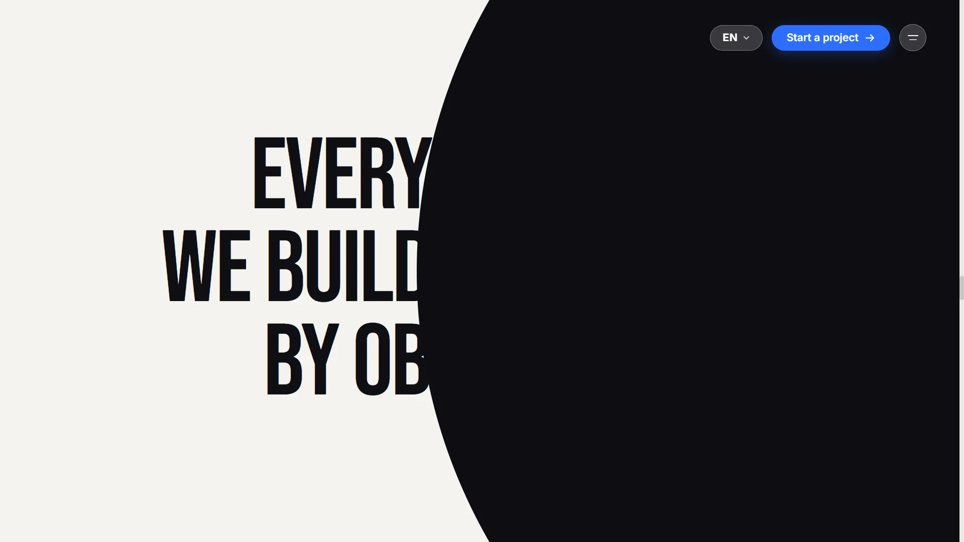
The Cinematic section references qclay’s scroll-driven team section directly. The phrase structure is: “EVERY PRODUCT / WE BUILD [slot] MADE / BY OBSESSIVES,” with the slot revealing “WAS” in electric blue at progress 0.88. Five avatar circles burst out from a central slot. Six project cards fly in from off-screen and settle at orbital positions with staggered rotations. Mouse parallax active.
The technical thing that surprised me: the two-wrapper pattern required for scroll reveal plus hover on the same element.
The useScrollReveal hook works by adding a .revealed class when an element enters the viewport. That class uses transform !important to override Tailwind’s translate utilities:
.revealed {
  transform: translateY(0) !important;
  opacity: 1;
}
The !important is required. But it also blocks hover transforms on the same element. If you add a hover lift to a .revealed element, the !important wins and the lift never happens.
The workaround: two wrappers. Outer div gets the useScrollReveal ref, owns the entrance animation. Inner div owns the hover transforms independently.
<div ref={revealRef}>        {/* ← .revealed goes here */}
  <div className="hover:scale-105 transition-transform">
    {/* content */}
  </div>
</div>
Both work. The outer one can !important freely without blocking anything inside it.
What the portfolio section taught me about proportions
The portfolio alternates between card pairs: 58% wide card and 42% narrow card, then swapped on the next row. awsmd.com-inspired.
The flex implementation has a specific trap. flex: "0 0 58%" (percentage-basis form) breaks when the sibling uses flexGrow: 1. Both cards fill full width. The correct form is unitless flex ratios:
style={{ flex: '58 0 0' }}   // 58-unit portion
style={{ flex: '42 0 0' }}   // 42-unit portion
Unitless ratios distribute space proportionally without fighting grow behavior. Small detail, but this kind of thing is what you’re actually doing when you build complex flex layouts: negotiating between percentage-basis, grow-shrink behavior, and min-content constraints until the browser does what you intended.
The honest status
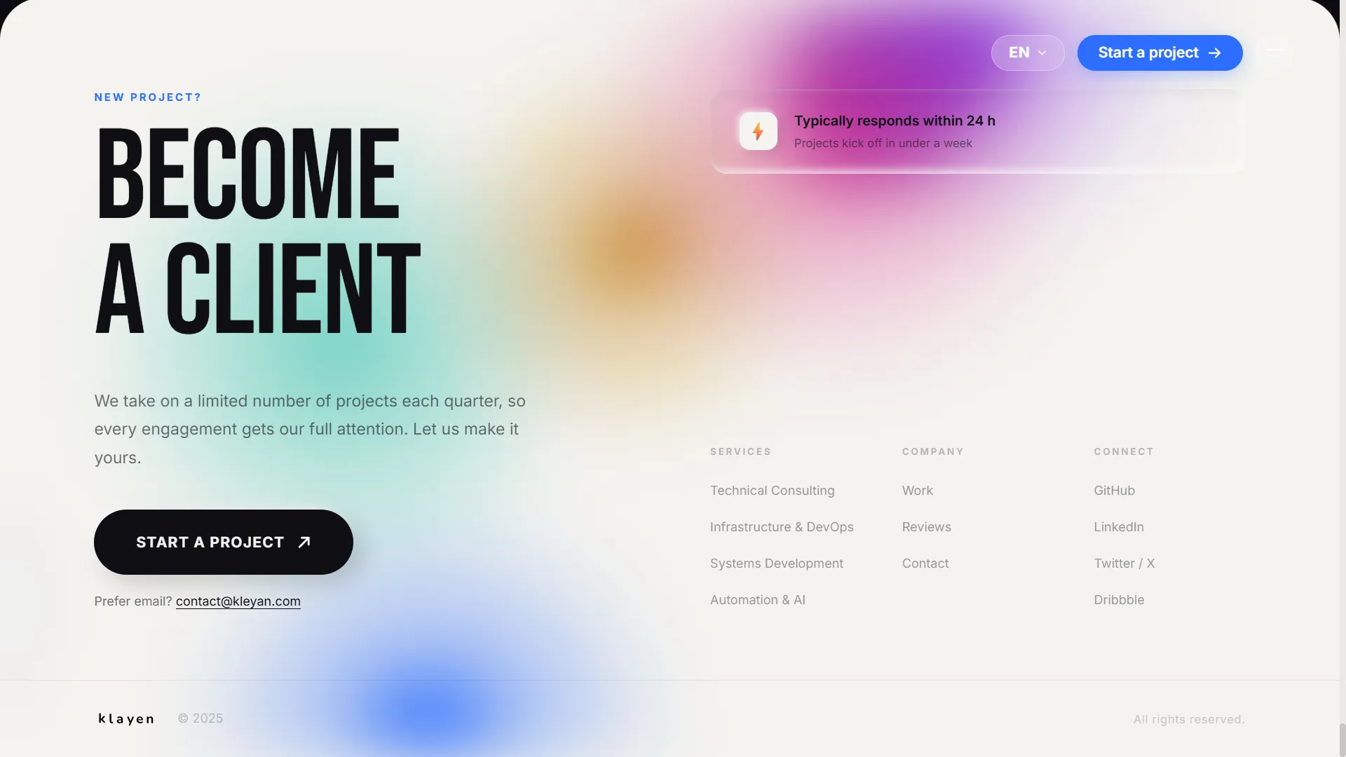
Nine sections built: Hero, ServicesSlider, Portfolio, Cinematic, About, Testimonials, Contact, Navbar, Footer. Desktop only. Build passes clean.
What’s not done: mobile responsive pass, Tailwind refactor, real project screenshots for the portfolio cards, real team photos, final copy from the client, production hosting on the Contabo VPS.
This is the part of Show Your Work that I find most useful to say out loud. The site looks finished in screenshots. It’s a demo build. The CSS previews in the portfolio cards are hand-drawn mockups with placeholder names. The testimonials are filler. The contact form has a success state but no backend route.
A demo build and a finished product are not the same thing, and calling one the other is how people get confused about what work actually takes.
What I keep using
Three things from this build that changed how I approach design work:
The neumorphic constraint forces token discipline. When element backgrounds must exactly match canvas, you stop tolerating approximate color values. Every surface that touches the neumorphic system gets a token or it doesn’t get built.
Scroll progress as a primitive. One 0→1 value, computed from a sticky element inside a tall wrapper, can drive an entire section worth of animation. You don’t need a library to do cinematic. You need a number and the discipline to map it correctly.
Show the iteration, not the outcome. The decisions log in this project documents every pivot: why we rejected dark, why we switched from percentage flex to unitless ratios, why the stats section was replaced by the cinematic sequence. Those decisions are the actual work. The sections you see in the browser are just the current state of a series of choices.
The site is not live yet. The remaining work is finishing work, not foundational work: the mobile pass, the real photographs, the final copy. The structure is done. The system holds.
There is a specific feeling that comes when you look at something you built and recognize it became more than what you set out to make. This started as a client brief. It became the clearest design statement I have put together. I do not always feel like an architect when I build things. Building Klayen, I did.
When it goes live, it will be the whole thing. Not just the version that looks finished in screenshots.
That’s the whole point.